

 01. Our Mission
Mineral Technologies
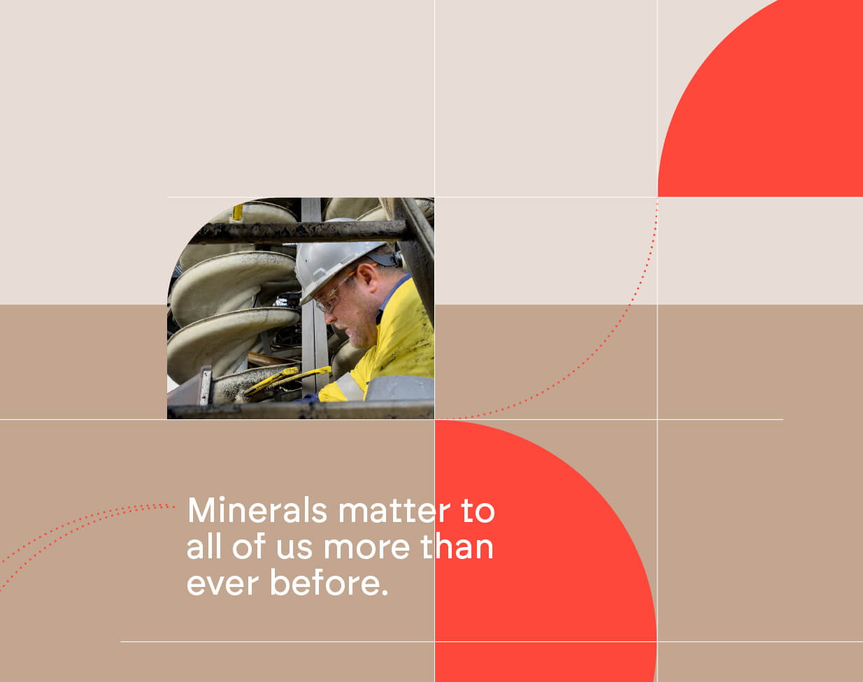
Minerals matter now more than ever before – and how we get them matters most.
With over 80 years experience in fine minerals recovery and technology development, our mission is to maximise complex fine minerals recovery for every client, because every mineral matters.
Your minerals matter.
We place every client with their mineral at the centre of every project. With expertise in equipment, engineering and process design, “Your mineral matters” drives every decision. It’s only through an incredible collective effort that success is possible – understanding we all have a responsibility to recover the highest possible amount of our clients’ deposits, no matter how complex.
02.
Brand Logo
The MT logo should be implemented in all communication in place of the current logo. It uses a smaller version of the “Ball”, with brighter colors and a new wordmark that focuses more on the company name.

03.
Primary Colours
To be integrated into all communication.
Black Sand
HEX 262626
RGB 38 38 38
CMYK 00 00 00 94
PANTONE 426 C
Red Ore
HEX ff473b
RGB 255 71 59
CMYK 00 85 78 00
PANTONE 2347 C
Dust
HEX c2a68f
RGB 194 166 143
CMYK 23 33 41 09
Sand
HEX d6c7ba
RGB 214 199 186
CMYK 19 22 27 00
White
HEX ffffff
RGB 255 255 255
CMYK 0 0 0 0
03.
Secondary Colours
To be used as additional accent colours, especially when categorising different topics or as accent colours in infographics. These could also be used to highlight different chapters in a presentation, or topics on a website.
Ocean
HEX 75bed5
RGB 117 190 213
Coast
HEX 46c1a5
RGB 70 193 165
Coral
HEX ebb6a4
RGB 235 182 164
Gold
HEX a8702e
RGB 168 112 46
Sun
HEX f9b618
RGB 249 182 24
Red Earth
HEX 973727
RGB 152 56 40
04.
Font: Brockmann
Mm
ABCDEFGHIJKLMNOPQRSTUVWXYZ
abcdefghijklmnopqrstuvwxyz
1234567890 !?#<>()[]{}+=@$€%^&*
Regular
Body copy / Sub-headings / Sublines / Descriptions
Mm
ABCDEFGHIJKLMNOPQRSTUVWXYZ
abcdefghijklmnopqrstuvwxyz
1234567890 !?#<>()[]{}+=@$€%^&*
Medium Italic
Quotations / Text emphasis
Mm
ABCDEFGHIJKLMNOPQRSTUVWXYZ
abcdefghijklmnopqrstuvwxyz
1234567890 !?#<>()[]{}+=@$€%^&*
Bold
Headlines / Sub-headings / Text emphasis
05.
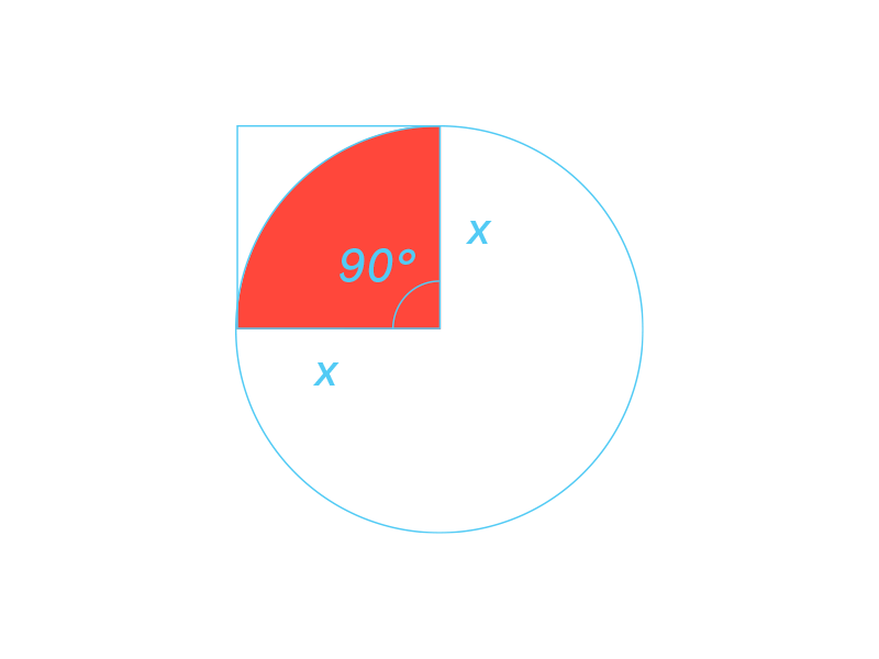
Process Symbol
The MT Process symbol can be used as a filled object or as outlined dotted curve to fill negative space, display photos with rounded corners, create a technical, structured appearance or appear from the side to direct attention to text. The white grid, placed on the sand background, displays the structure and technical heart of MT Engineering. It creates order, and can hold pictures, lists, or just be used as a graphic element.
05.
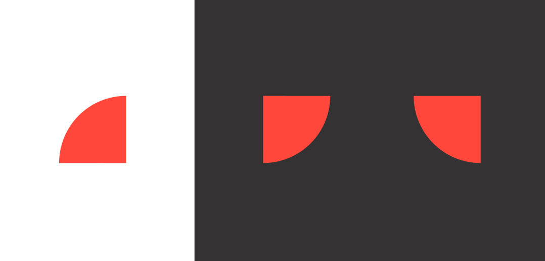
Graphic Elements
MT Process Symbol
– Use only as a blue or white element.
– Never make the symbol transparent or semi-transparent.
– Use very purposefully, and do not overuse. The symbol should not appear more than twice on a page, or else it loses it’s value.
– The Symbold can be fliped 90° or 180° in any direction, but should never be diagonally rotated (45°).
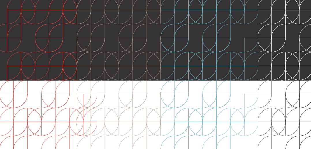
Process Pattern
The Process Pattern is a wallpaper that can be used purely as a decorative element, as a background fill, or as an overlay over a photo.
– Should not distract, or appear to be the hero, but rather always support hero content (large headline or photo)
– It can be implemented over entire pages or cropped to fit less surface area, and use used on coloured or white backgrounds.
– Semi-transparency is allowed in order to create a more subtle, less dominating impression.
06.
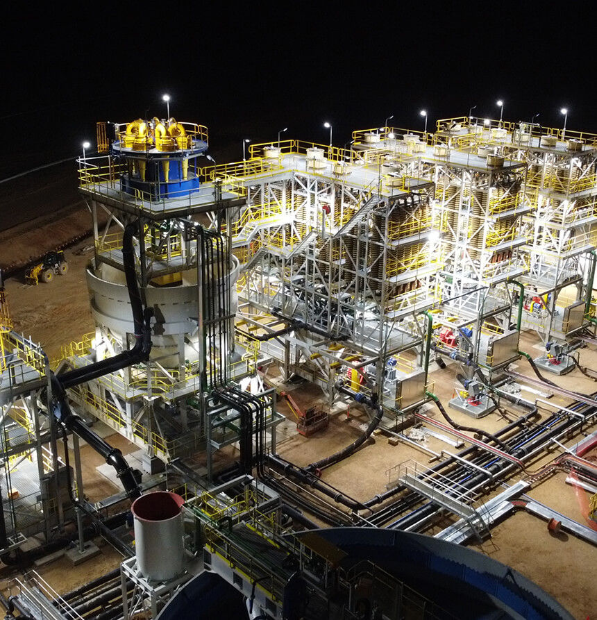
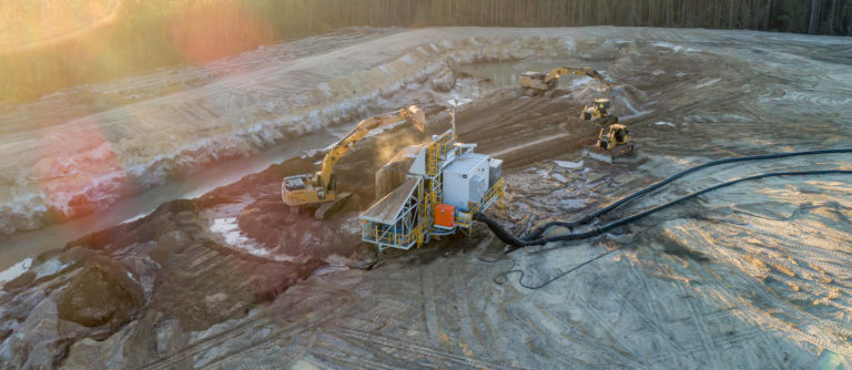
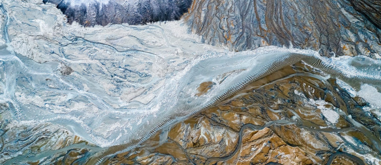
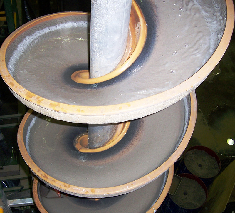
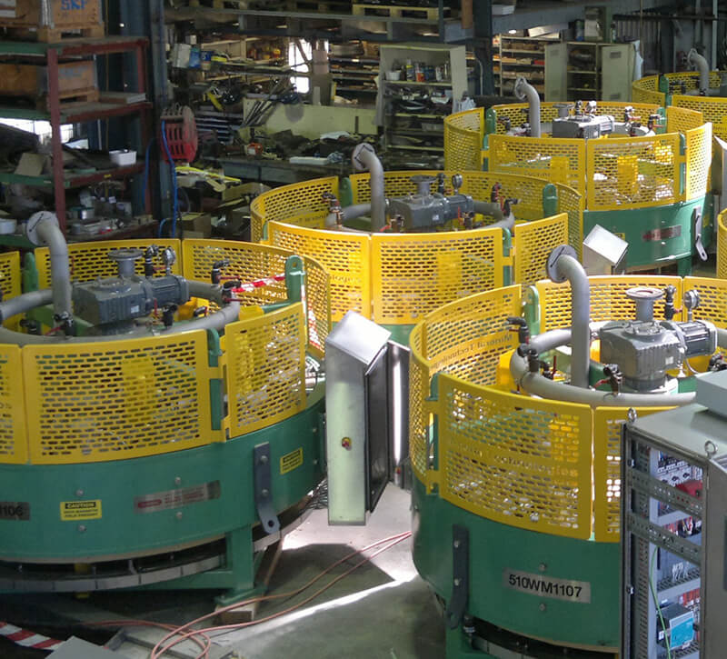
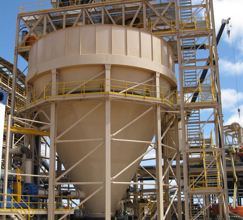
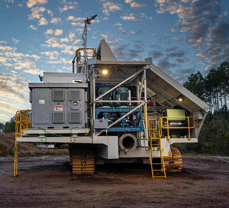
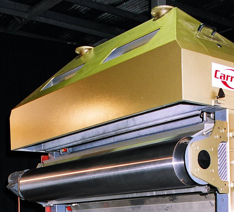
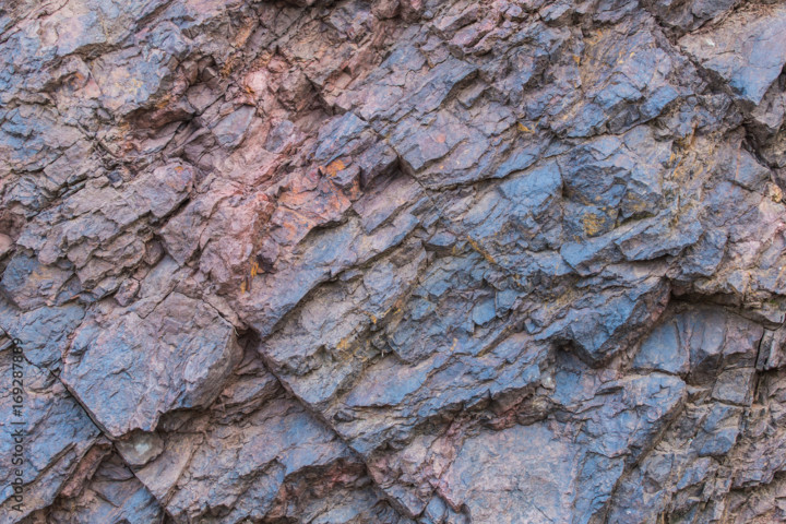
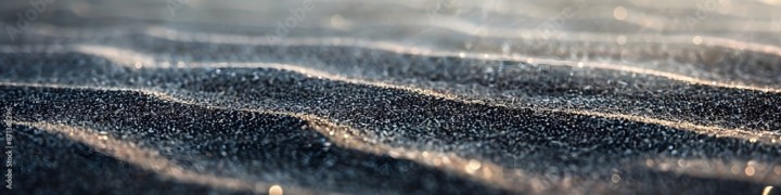
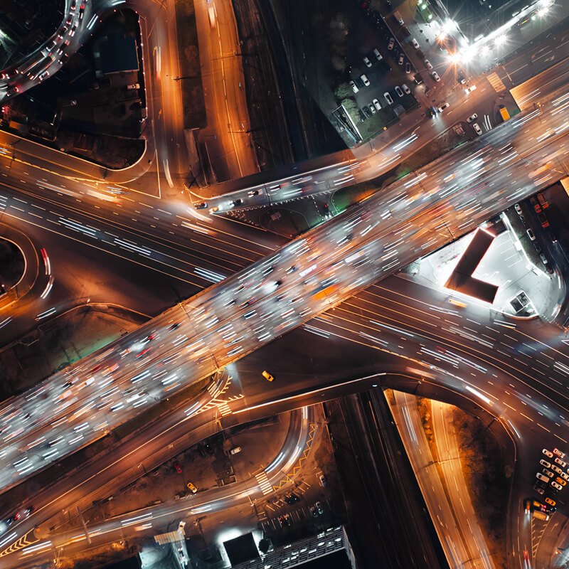
Photography Style
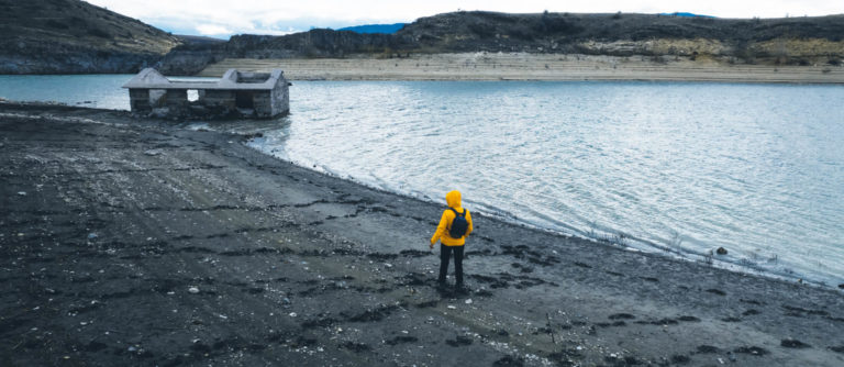
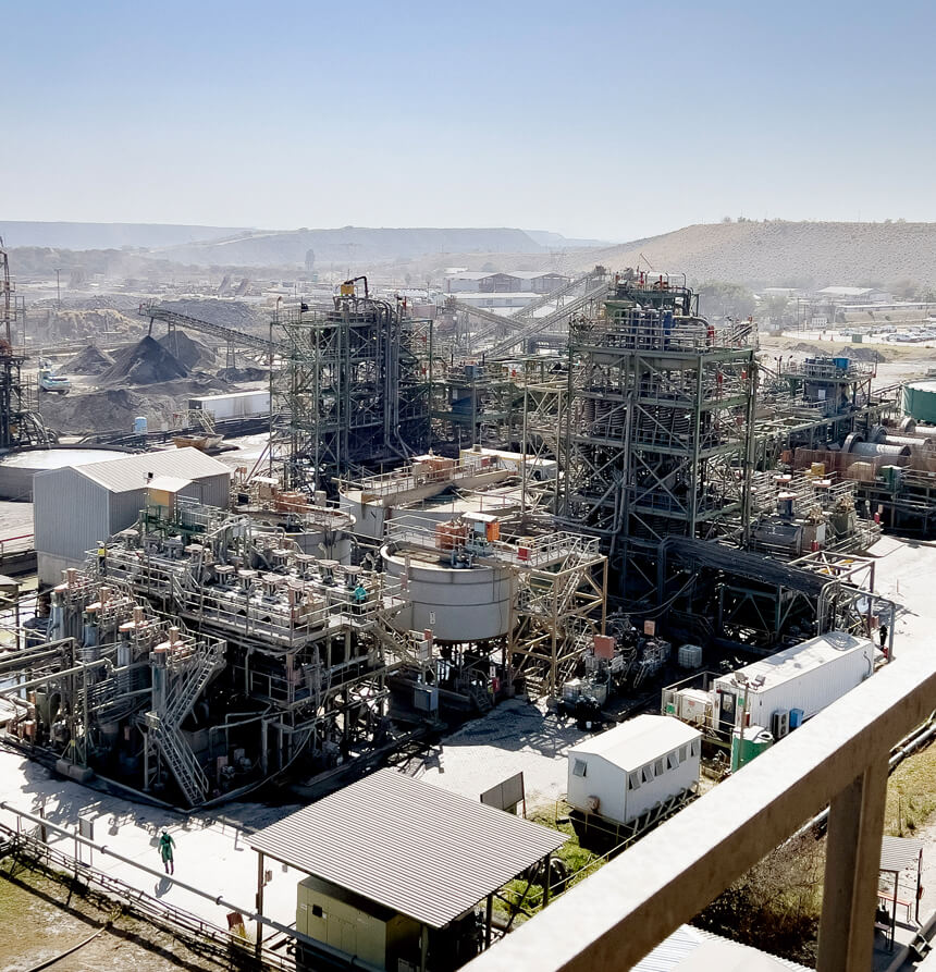
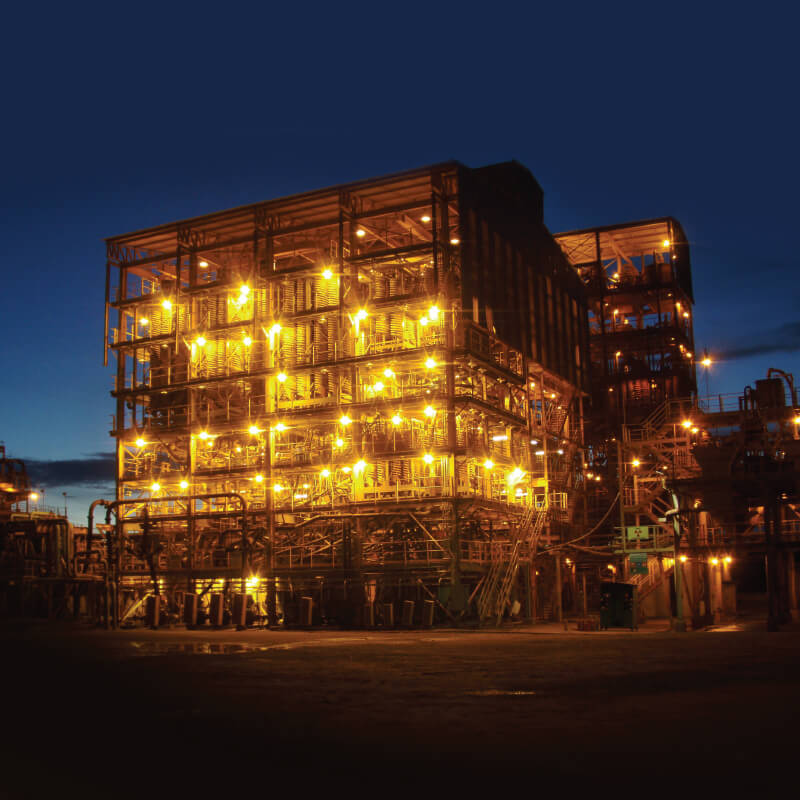
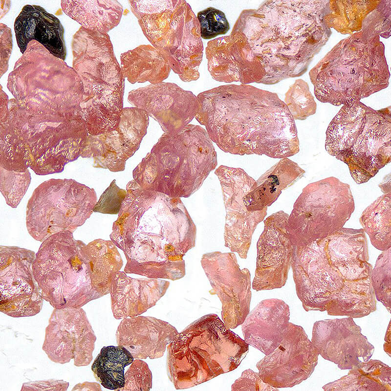
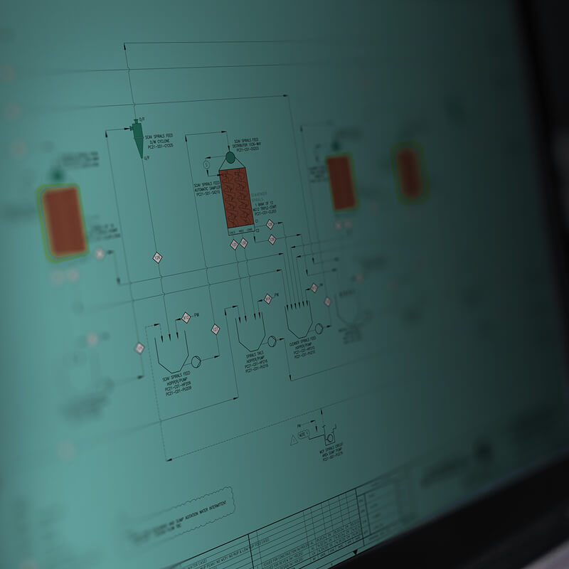
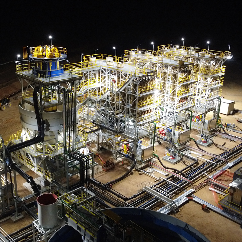
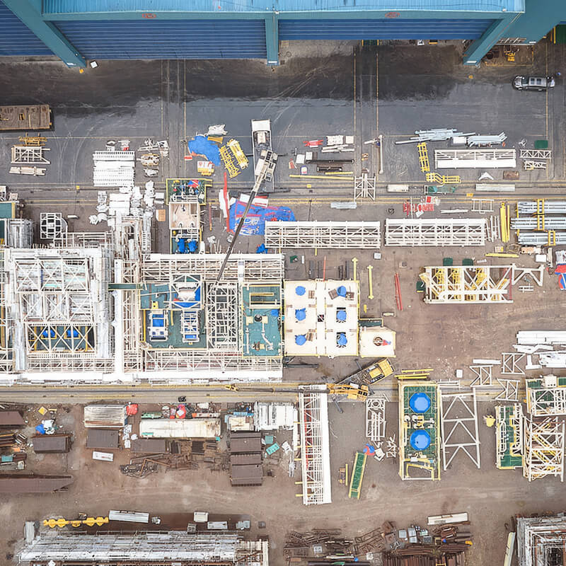
Here are photography styles that suite MT. Keeping 1 focal point – avoiding wide-angle shots with everything in-focus. Shallow depth of field emphasises key focal point and tells a better story. Equipment and factory should utilise repetition, order and texture of materials to bring across MT’s attention to detail and engineering expertise. Photos of employees and people should depicting a professional yet relaxed environment, where people enjoy what they do. There should always be a sense of adventure, concentration or excitement.

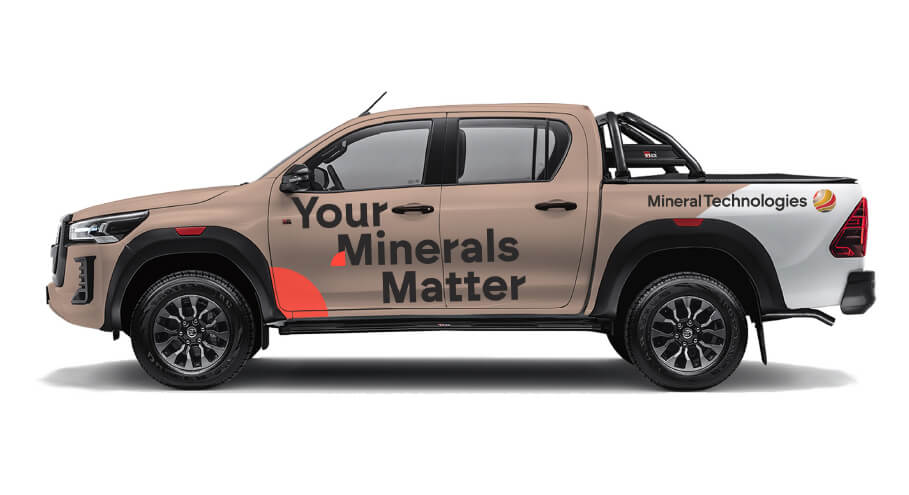
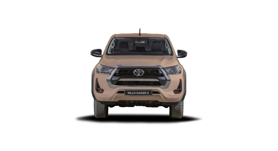
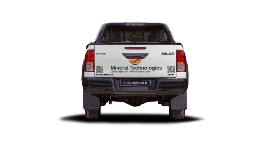
07.
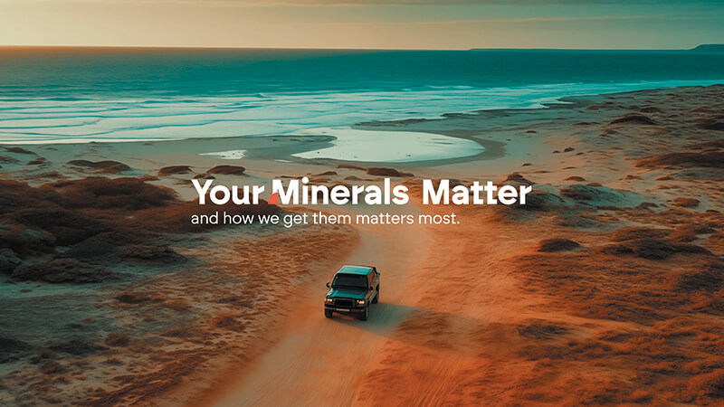
Example - Car Branding
Our fleet of cars and trucks reflect our adventuresome spirit. Wrapped in two-tone brand graphics, our bold message “Your Minerals Matter” is the key takeaway. Pictured: 2024 Toyota Hilux | Other recommendations: 2024 Toyota Land Cruiser.

08.
Key Visual - Image
Please click on the following download button to view and download the image in high resolution (20 MB, 300 DPI, CMYK Colors). Only this image may be used for print files.